
The year 2021 was very important for our company in at least one respect. The process of rebranding our corporate identity (CID) began, the first phase ended in the autumn and winter of 2022, and we have continued the subsequent steps to this day. So let's talk to our colleagues from our marketing team about what such a rebranding actually entails. Both in general and specifically within the OKIN Facility. It's going to be a bit of a long talk, so we've divided it into three parts and this is the second one.
Let's go back a little bit to the rebranding itself. What else has it affected?
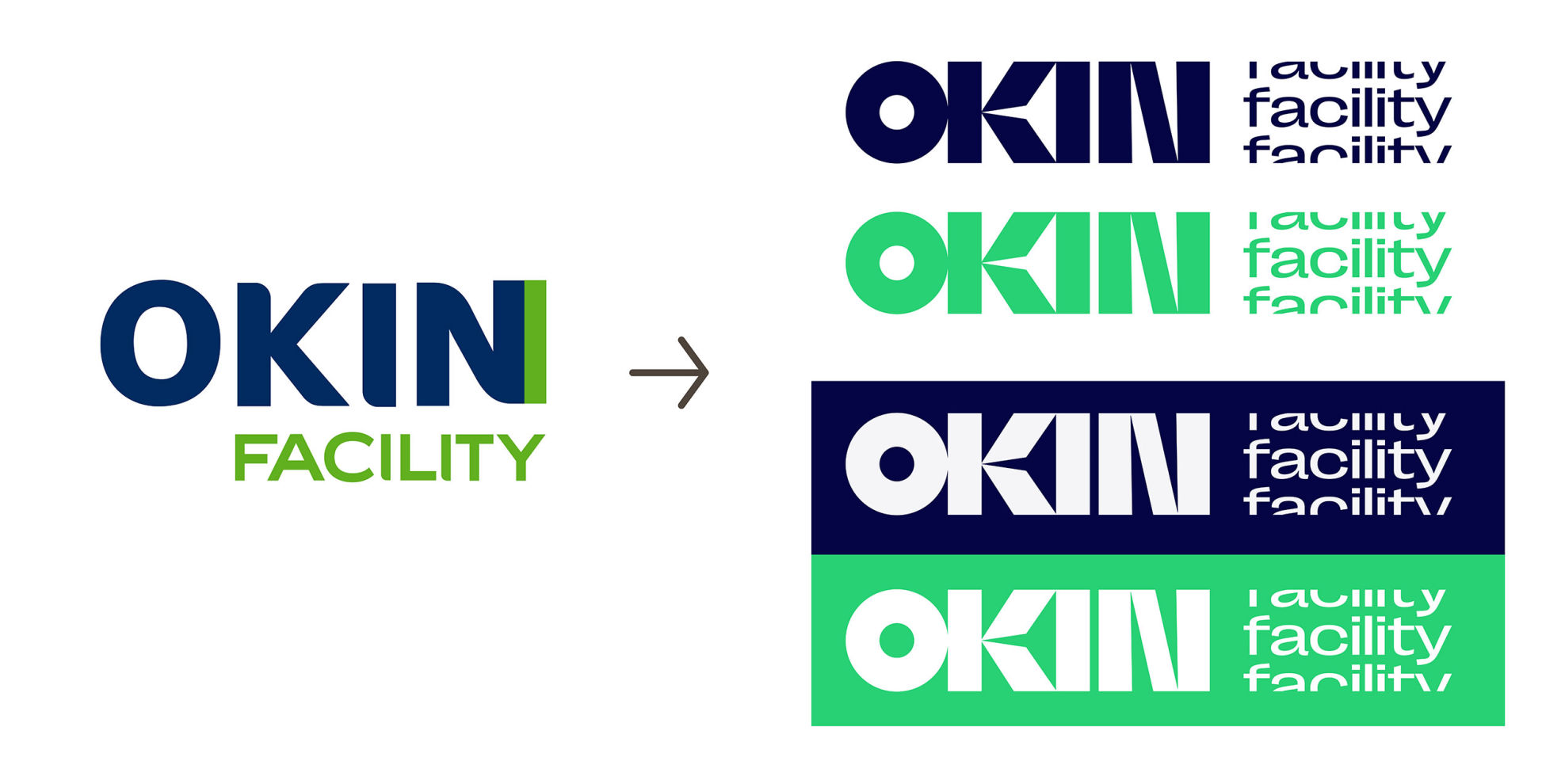
Naturally, it was a comprehensive package of changes. As we've already said, in the vast majority of cases the reasons for changing CID (corporate identity) come from within, so to speak, and rebranding is therefore not a cause but rather a consequence. At the same time, it is good to build on what has worked and proven itself. For example, we kept the originally defined colour scheme but changed its shades. We have long used two basic colours, blue and green, in OKIN Facility's visual communication. Blue is common to all parts of the OKIN Group and green is "our" specific colour. The basic blue colour was modified as part of the modernisation of the OKIN Group CID, but the changes were rather cosmetic and we now call it "Dark Blue". The green colour has been given a completely new "Bright Green" shade, which has contributed significantly to the modernisation of the overall brand identity. In addition to these two basic colours, we have also added two complementary colours - dark green and light grey - which dynamically complement the colour range.
The logo design is visibly different from the current version. However, this is not the result of some random graphic creation, but is based on the group's logo design and also uses the same basic principles as most of the other companies under the OKIN umbrella. It is therefore a kind of consolidation of the CID across the whole group. As far as the OKIN Facility logo is concerned, we currently use primarily two basic versions of the logo, namely green and blue. Always depending on the specific application.
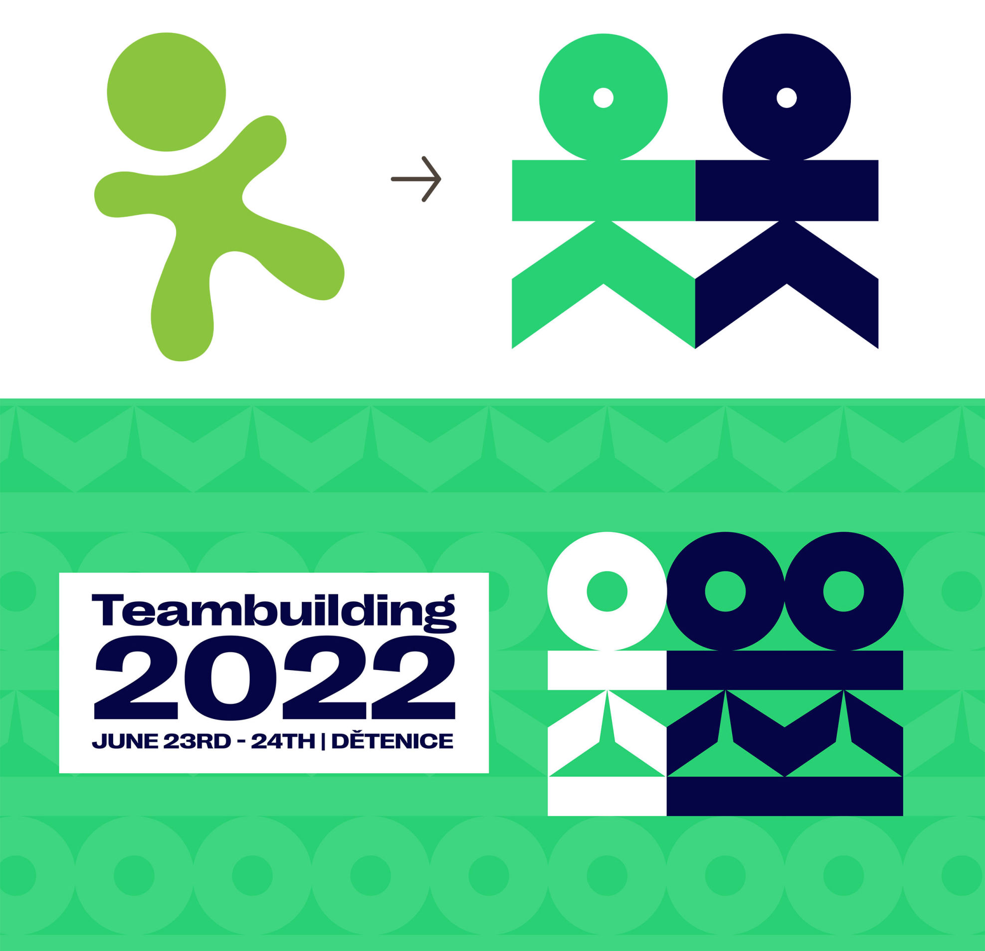
Another new element in communication is the font. Our new one is distinctive, strong and very easy to work with. There has also been a complete change, actually a creation, of a dedicated set of icons. Their strength lies primarily in the possibility of much wider use than was possible in the past. Last but not least, we have also redesigned our "family silver", the "Okindoll". This graphic element in the form of a doll has been a distinctive and characteristic symbol of the OKIN Facility for many years and it was therefore not easy to commit to this change. However, it eventually evolved and also changed its position in communication. Nowadays, we use it mainly for internal communication. The new "Okinaut", as we call it, uses more colours and is inspired by the design elements in the logo.
(In the final installment of our miniseries, you'll find a sample of the company´s clothing, car wraps and author´s photos.)